TOP 16 LOGO SECRETS REVEALED
Introduction :
Today we see about the secrets behind the famous companies logo like adidas, apple ,bmw ,coca-cola,toyota.
In our daily life we see this companies logo everywhere but never consider what their logos mean exactly, but every line curve and color has meaning behind it most of them were designed to indicate something much more than simple beauty.
Are you Curious to know ?
Watch the 16 famous logos with a hidden meaning you've never noticed in your life.
16 .Hyundai
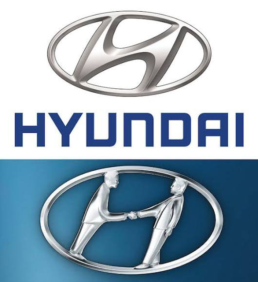
Many people think that the logo of the south korean company Hyundai is simply the first letter of its name.In fact the letter "H" symbolizes two peoples, a client and a representative of the company,shaking hands that's very thoughtful.
It shows the trust and relationship between the client and the representative of the company.
15.Adidas
The name adidas is derived from that ,of its founder adolf dassler's name .The company's logo has changed over time but, it has always included three stripes .The current logo is three stripes at an angle which together form a triangle.
This symbolises a mountain which in turn represents ,the challenges that all sportsmen have to overcome day after a new day .This will give a motivation to the customers. So, they designed like that.
14.Apple
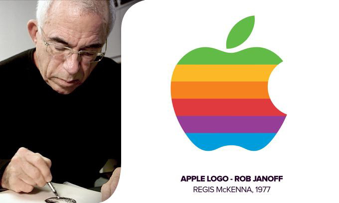
Rob Janoff the designer who came up with a world famous apple company logo.He explained his idea of the logo in one of his interviews.
He bought a bag of apples placed them in a bowl.And spent time drawing them for a week, trying to break the image down into something simple.so,he taking a bite out of an apple was the experiment completely by his coincidence.
BYTE
OR
BITE
He realized that apple's bite sounded exactly the same as the computer term bite isn't this guy top of his field.
13.Vaio
The first two letters of the vaio(V and A) logo symbolize an analog wave.The last two are similar to the numbers one and zero .
That is symbols of a digital signal, which are the binary numbers of computers. It looks easy but the effort behind it was difficult.
12.Amazon
At first glance amazon's logo appears to be nothing special. However it was designed with a company's philosophy in mind .The orange arrow is similar to a smile because the company wants its customers to be satisfied the arrow.
And is also stretched between the letters a and z ,is a hint that the company sells absolutely every product, which means a to z products you can imagine.
11.Baskin Robbins
baskin robbins was a icecream companythe pink colored parts of the "BR" section make up the number 31 which denotes,"how many ice cream flavors, that baskin robbins used to famously sell ,have you tried them all ?".
10. Toyota
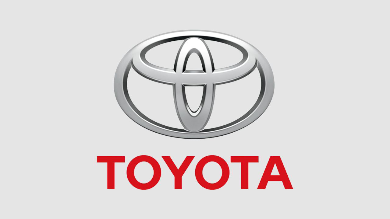
Many people compare the logo of this japanese car producer to an image of a cowboy wearing a hat but it is not the real reason.In fact, it represents a stylized image of a needle eye with a thread passing through it.
This is a hint at the company's past business, which they used to produce weaving machines. However the individual parts of the logo also spell out the letters of the company's name.
9.Continental
Continental, a famous car tire producer.They has a logo in which the first two letters depict a car wheel.Yeah! everything genial is simple.
8.Formula One
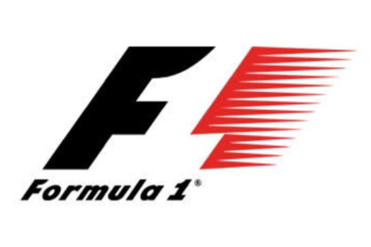
Formula One is a car manufacturing company,which manufactures race cars.Its logo was " f " with some strips in red colour.If you look carefully at the white space between the letter f and the red stripes, you can see the number one.
The red stripes are also meant to be a graphical representation of the high speed of formula one cars.
7.Pinterest
Printest was an website or app which contains a collection Picture.On pinterest people collect images they like from across the internet and pin them to their online boards. So, that's why the image of a pin is hidden in the letter p simple and clear.
6.Beats
Beats ,is an audio equipment producer based in the usa. Tey uses a logo in which the letter b looks like headphones on a person's head less definitely means more.
5.Toblerone
Toblerone the famous chocolate company based in burns switzerland. It has a silhouette of a bear in its logo, that's because burn is sometimes called a city of bears.
You can see a lot of these animal figures throughout the town in fountains at the clock tower and even on buildings.
4.BMW
Yes, BMW's logo had a wonderful secret and there is no intro to them. They say that the central part of the logo symbolises, the rotating blades of an airplane. This is linked to the company's early history of aviation technology.In fact it is simply a part of the bavarian flag the area of germany where the company originated.
3.LG
LG was an south korean electronics company with a great market.The logo of this LG is a stylized image of a person's face according to the company. This represents its aspiration to have ordinary human relations with their customers.
2.Evernote
Evernote was an company which involves in the production of notebooks.Ok,lets see the secret behind the logo of this Evernote.We all know that,elephants have impressive memories.
They can remember both faces and events,that's why evernote a note-taking application uses this animal as part of the logo. And you will also notice that,the corner of the elephant's ear is folded over in a similar way how people fold the corner of a page to make notes.
1. Coca-Cola
And finally we come to the first place, that's Coca-Cola.In the coca-cola logo in the space between the letters "O" and "L" you can clearly see the danish flag.Ipt's purely a coincidence nevertheless coca-cola has used this as part of its marketing campaigns in the scandinavian country.
Conclusion :
OK. The list is over we will meet in our next post.And one more thing, this is listed by ourselves.It's not in correct order. Because, no one is best in the world. So, see only as secret not as Rankings.







Comments